Behind the design: Stem Systems.
Five design decisions behind the Stem Systems identity, as a swipeable carousel. The full case study is here, and I post more like this on LinkedIn.
Read it as text
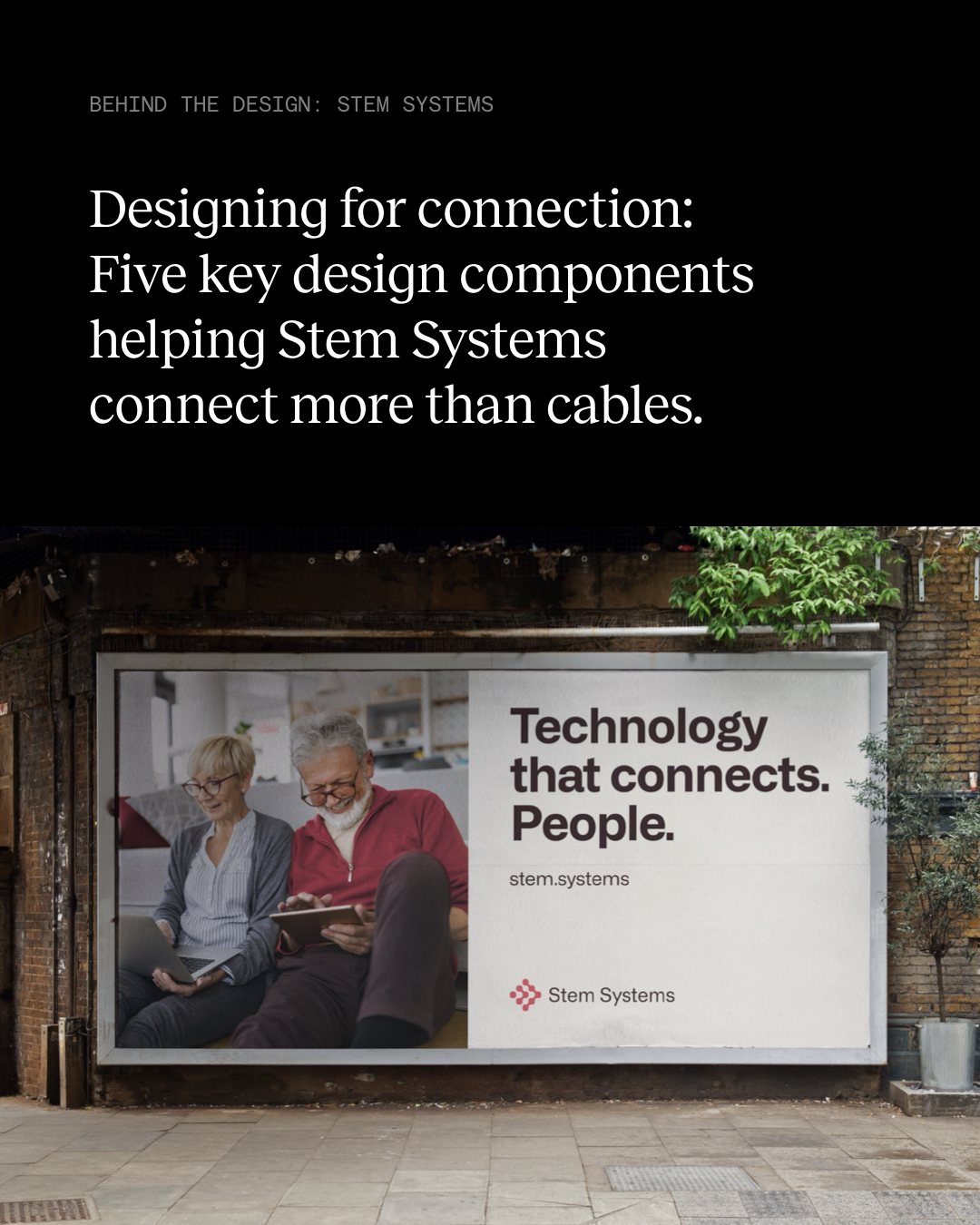
Designing for connection
Designing for connection: Five key design components helping Stem Systems connect more than cables.
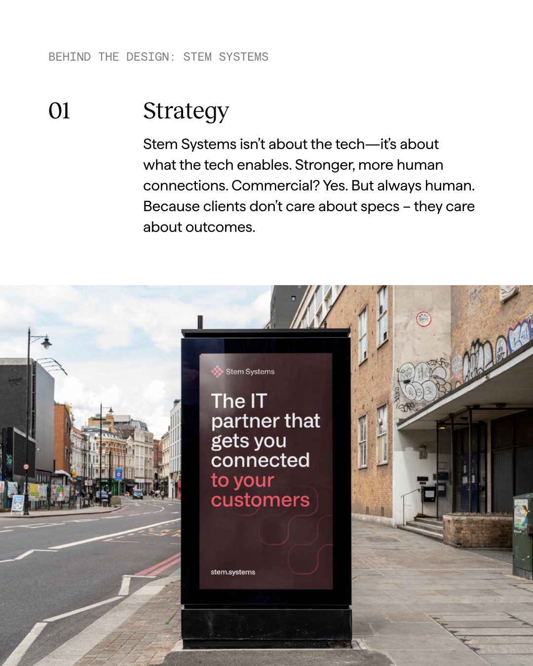
01 Strategy
Stem Systems isn’t about the tech—it’s about what the tech enables. Stronger, more human connections. Commercial? Yes. But always human. Because clients don’t care about specs – they care about outcomes.
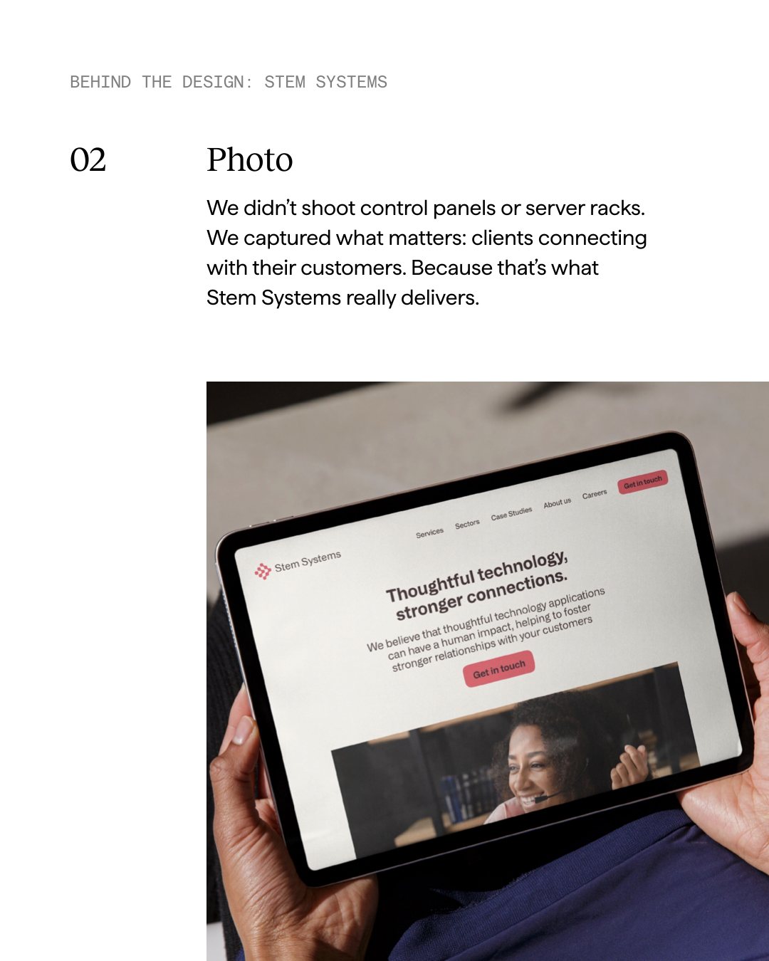
02 Photo
We didn’t shoot control panels or server racks. We captured what matters: clients connecting with their customers. Because that’s what Stem Systems really delivers.
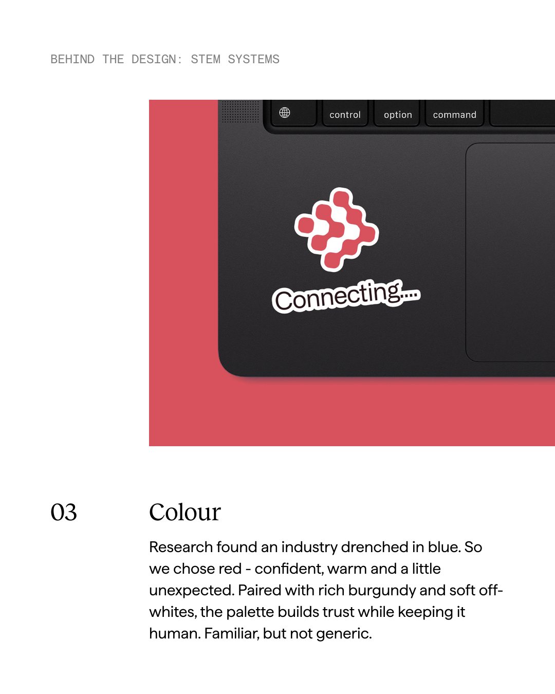
03 Colour
Research found an industry drenched in blue. So we chose red - confident, warm and a little unexpected. Paired with rich burgundy and soft off-whites, the palette builds trust while keeping it human. Familiar, but not generic.
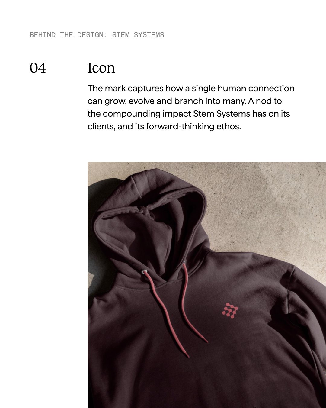
04 Icon
The mark captures how a single human connection can grow, evolve and branch into many. A nod to the compounding impact Stem Systems has on its clients, and its forward-thinking ethos.
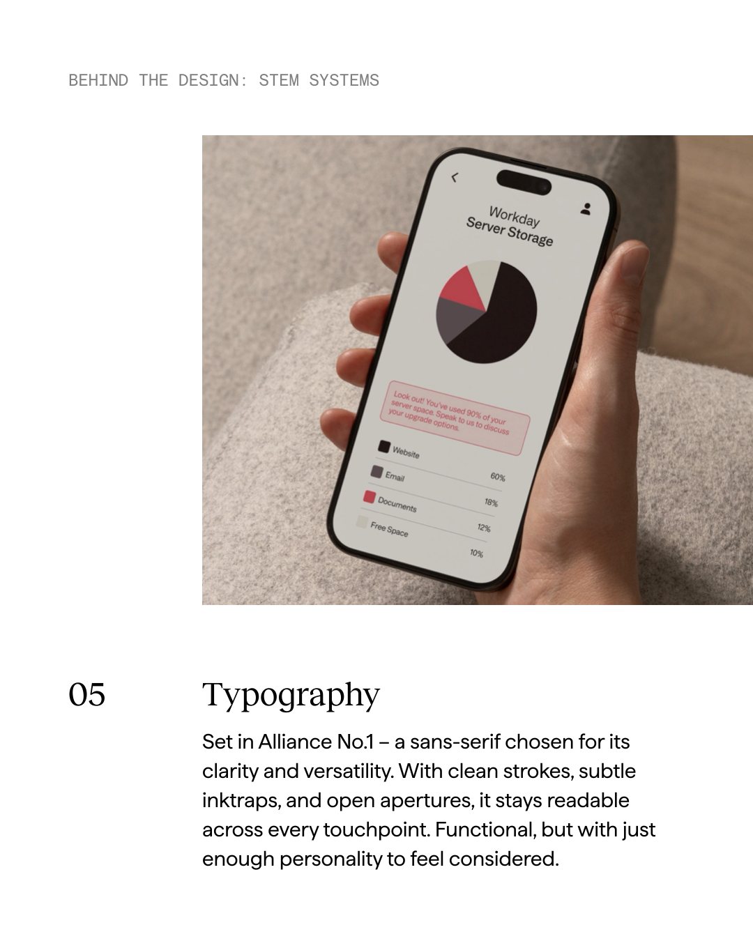
05 Typography
Set in Alliance No.1 – a sans-serif chosen for its clarity and versatility. With clean strokes, subtle inktraps, and open apertures, it stays readable across every touchpoint. Functional, but with just enough personality to feel considered.
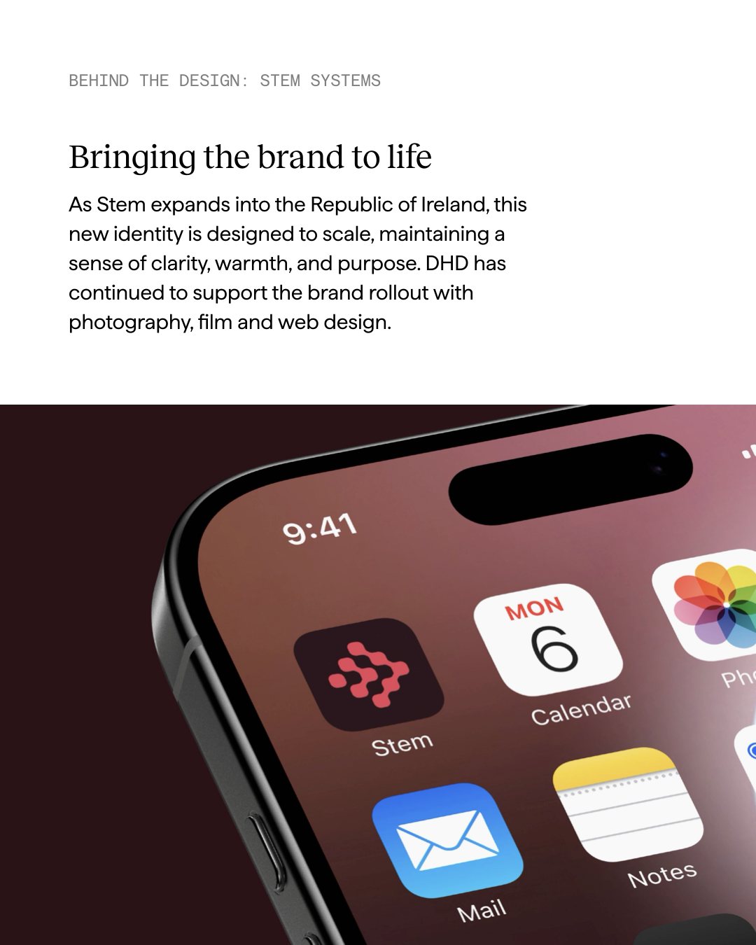
Bringing the brand to life
Bringing the brand to life: As Stem expands into the Republic of Ireland, this new identity is designed to scale, maintaining a sense of clarity, warmth, and purpose. DHD has continued to support the brand rollout with photography, film and web design.