Chapter & Verse: reading, notes and prayer in one calm app.
- Role
- Design and build
- Year
- 2026
- For
- iPhone and iPad
- Built with
- SwiftUI, SwiftData, iCloud, Claude
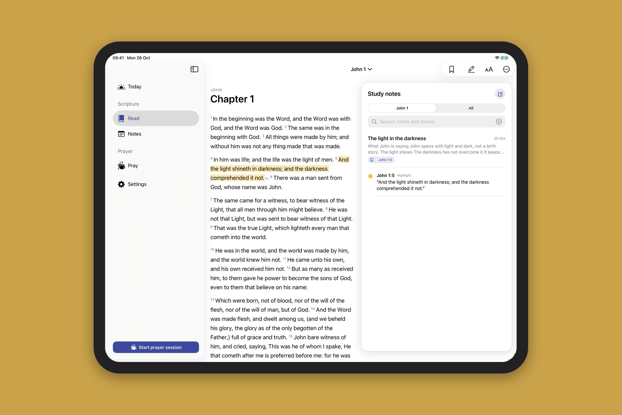
On iPad, notes open beside the text so you never lose your place.
The brief
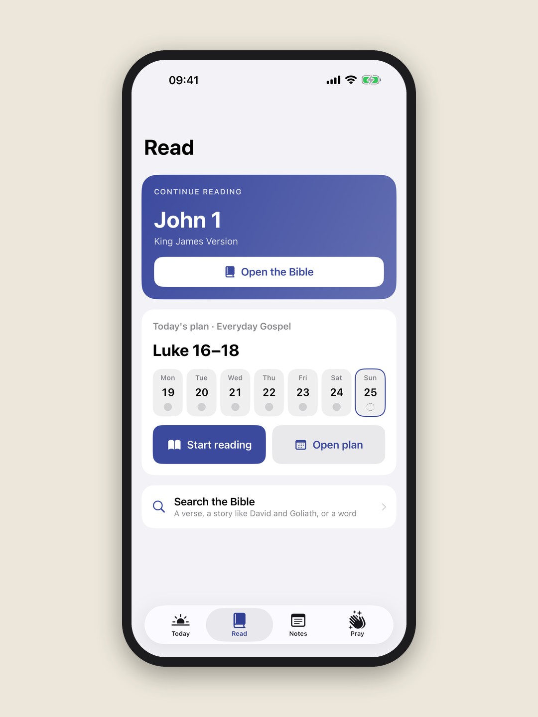
I set myself a simple brief. One app for reading the Bible, keeping study notes and praying through what I'd read. Most apps I tried did one of those well and bolted on the others, or filled the screen with features I didn't use.
So the design goal was restraint. The text comes first. Everything else waits until you ask for it.
Reading
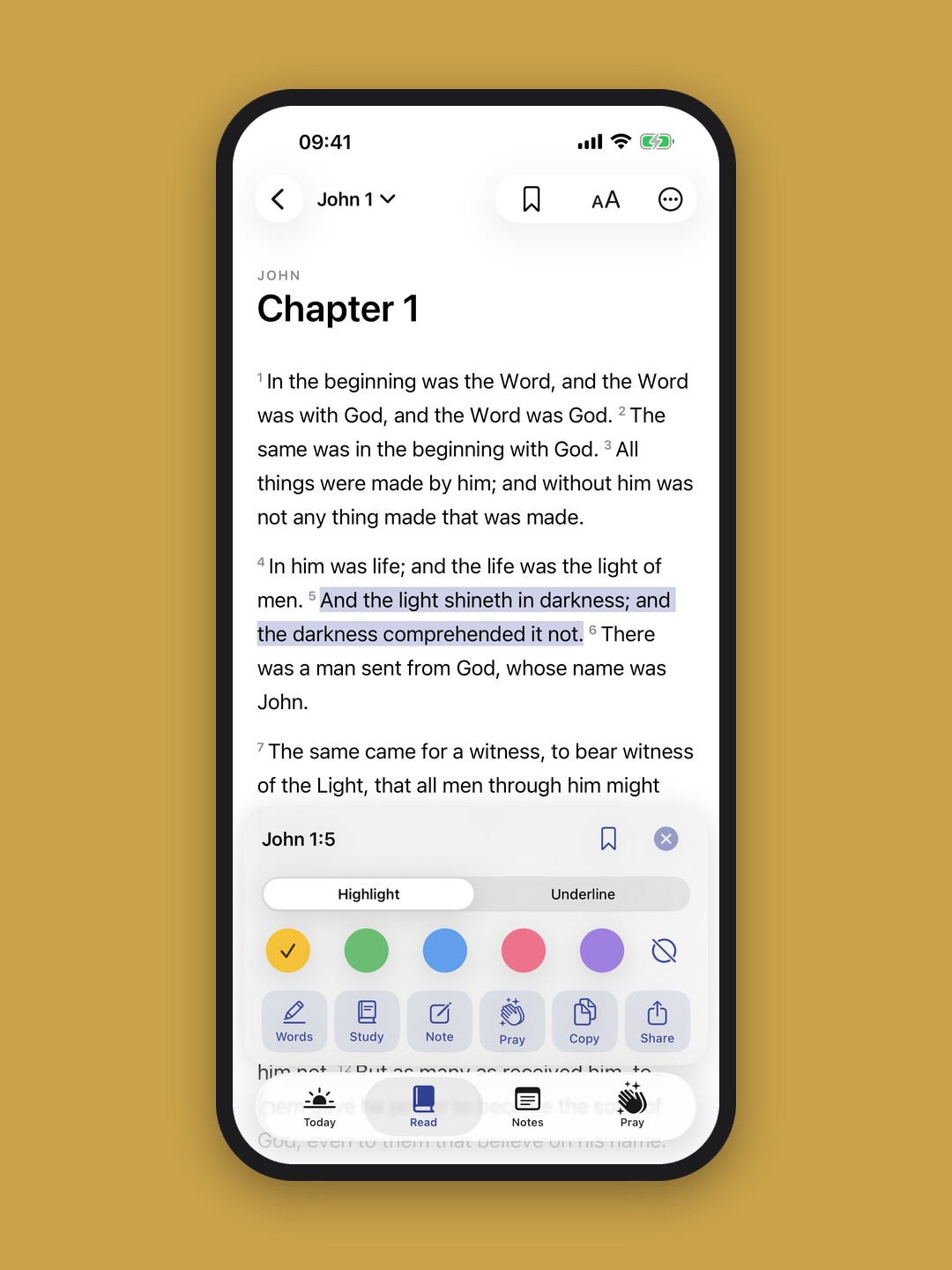
Tap a verse to select it, then highlight it in one of five colours, add a note or turn it into a prayer point. The markup bar is large on purpose, because people use this with a coffee in one hand.
Reading settings cover typeface, size, line and letter spacing, column width and page colour. They're the same controls I'd want in any reading app, and they're the ones most Bible apps leave out.
Study
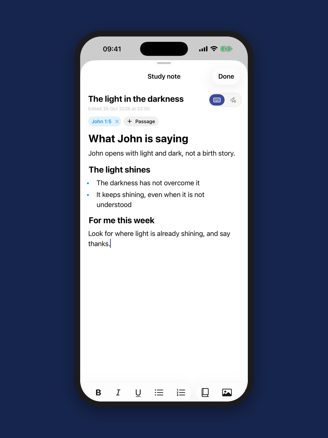
Notes can sit on a verse or stand alone. They have folders, a speaker field for sermon notes, and search that understands a word, a passage or a plain date like "last Sunday".
On iPad, notes open in a pane beside the text. That one layout decision did more for the app than any feature, because you can write without losing your place.
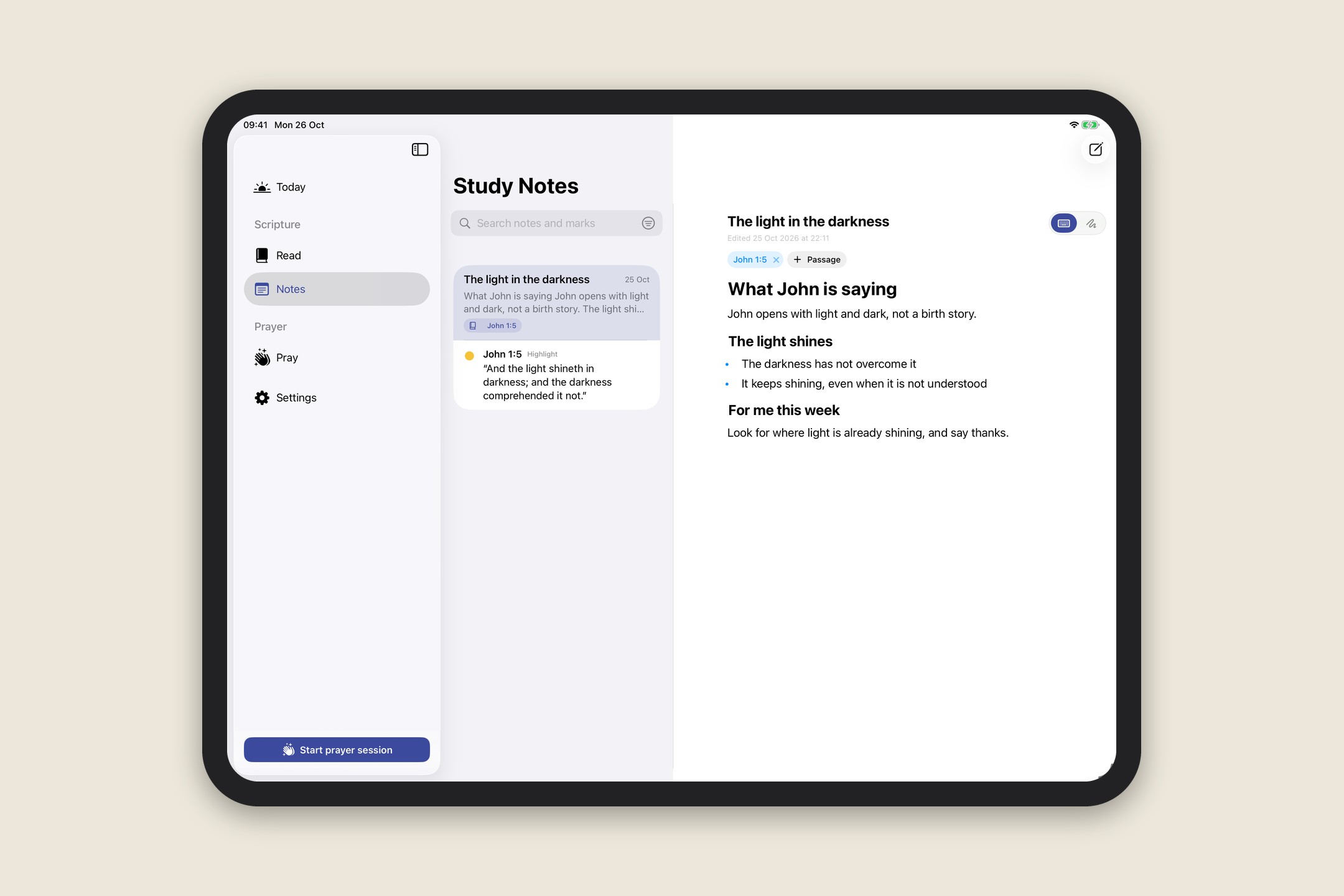
The notes library on iPad.
Prayer
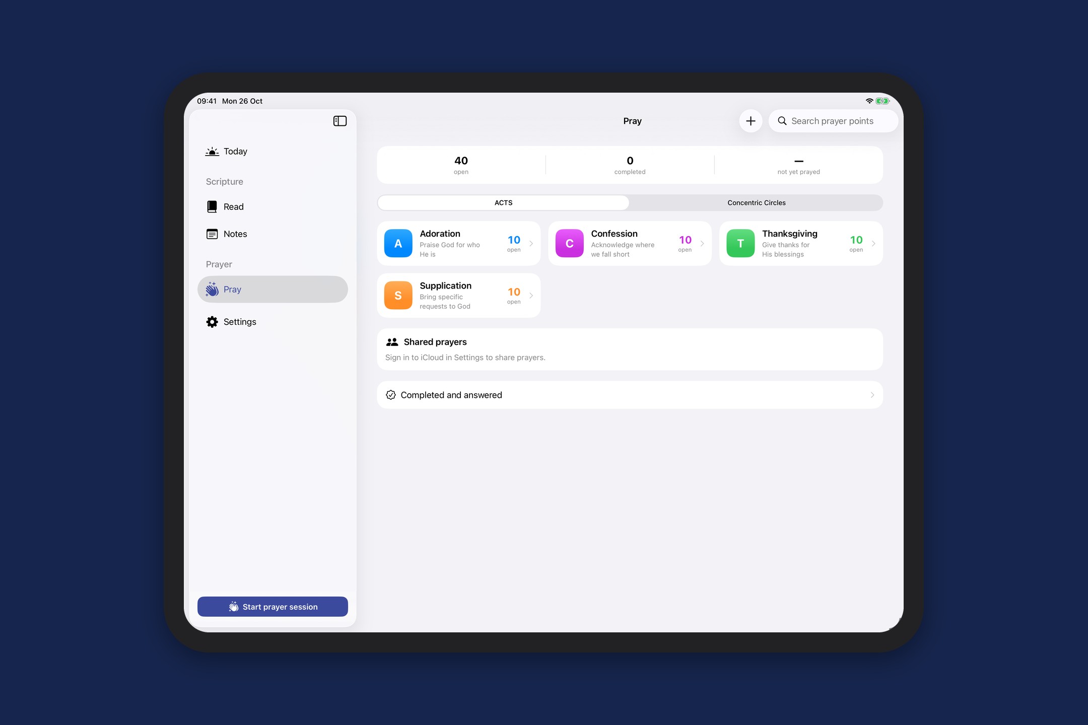
Any verse can become a prayer point. Prayer points can be ticked off when they're answered, and shared through iCloud with up to eight people. Anyone in the group can mark one complete, so a family or a small group can pray through the same list.
Everything syncs between devices through iCloud. There's no account to make and nothing stored on a server I run.
How it was made
I designed every screen and made every product decision. Claude wrote most of the Swift with me, a feature at a time, and I tested each build on my own phone before moving on.
That split is the same one I use on client work. The machine is fast at the parts with a right answer. The parts that need taste and judgement, like what to leave out, stayed with me.
The best feature turned out to be a layout: notes beside the text, not on top of it.
Made with AI, and where
Design, product decisions and this write-up are mine. The Swift code was written with Claude and checked by me on real devices.